Pages

Friday, June 3, 2011

It's again been too long, and I have no excuse.

It's hard to keep up on an art blog when art production slides to a halt. Well, a halt might be a little dramatic, but between my day job and the onset of spring, I have been spending VERY little time at my desk. The commission jobs that I have been working on have been sparse and are still in production, so there's almost nothing to report!

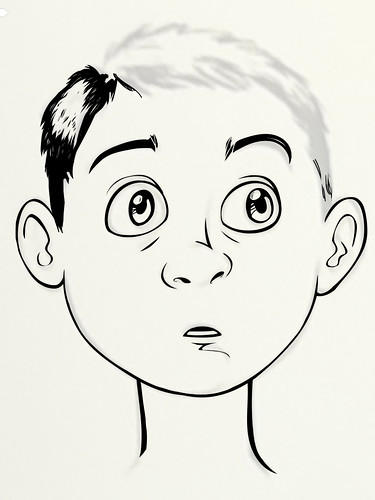
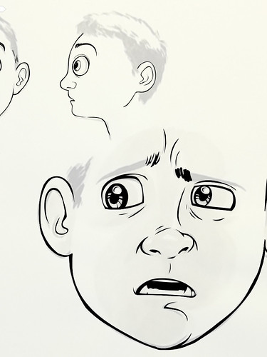
So, you, my good and fainthful reader, get to bask in the glory of unfinished character sketches for an upcoming project that I'm ALMOST ready to talk about. Officially, I mean.

These character designs were drawn in my sketchbook and inked in that Adobe ipad thingy I told you about months ago, back when I was a better person, who kept up on his blog. It realy is THE best for digital 'ink' lines. Just look at those edges!

Also... He has, um, a cat. *shameful kitty cat sketches EXPOSED*

Monday, April 4, 2011

Sometimes, You Gotta Spoil Yourself

In this particular case, the spoiling came in the form of an ipad 2, and was justified in that I honestly believed (fingers crossed) that it could be used as a completely portable art-making interface! At the very least, it could serve as a color sketchbook with one sketchbook forever, and one pen forever. It's been two weeks, and the results are, so far, promising. The hitch in the ipad-as-an-art-kit get-up is the lack of a perfect arts app that covers all bases. As of this writing, I have to spread most of my projects over three, with separate but equal strengths and drawbacks.

The first one I picked up, and the most popular among the online artists I stalked to get opinions, is Sketchbook Pro by autodesk inc. It costs $6.99, supports up to six layers, has a seriously great UI, featuring multi-finger swipes and commands that really speed up the menu-juggling that comes with any toolbox as robust as that featured by SBP. Wolverine up above was sketched, inked and colored as separate layers in SBP, in about half an hour. Down below is the 'painted' layer of a carrot car concept, clearly unfinished, but it nicely illustrates the ability of SBP to emulate paint and brush strokes in a really nice way.


Next up is Adobe Ideas, by, er, Adobe. The big benefits here are that it's FREE (!), but you have to pay a fiver to utilize layers, which is kind of a must. The bread and butter of this one is that it is vector based, which means, while you can't do any blending or gradients in this one, it makes GORGEOUS lines, which have no fixed resolution, and you can export to your main computer as a .psd with layers intact.

To be fair, al of the three programs mentioned here can export in a variety of formats, most usefully .psd.

Adobe's got something of a learning curve, and far less features than either Art Studio or Sketchbook, but for boundless resolution of line work, it can be pretty valuable for the artist working on the go. See the carrot-car inks below for an example of what Adobe Ideas can do.


Not surprisingly, Adobe (finally) came out last week and demoed a (mostly) full-fledged ipad-friendly version of photoshop. What they DIDN'T tell us is when it comes out and how many dollars we'll have to fork over once it drops. For the time being, and for just a few bucks, photoshop-friendlies can make due with the admittedly unattractive UI of Art Studio. From app icon to the static loading image to the font they chose for the title screen, this app is goofy looking. The icons for each tool don't give up their names, even when hovered over, and the icons themselves often don't convey clearly what the tool will do. It is my opinion that a user unfamiliar with photoshop, it's tools and it's menu system, might feel lost in Art Studio.

All design complaints aside, of the three apps I've been using, it is easily the deepest and most usable of the three. You just have to get past the design and learning curve. Check out my version of Rooster below.


It's my proudest and most finished ipad-artwork, and, after the initial sketch (which I did in Sketchbook and then imported into Art Studio) made completely on ipad, in Art Studio. It's a great program, it's $2.99, and offers the highest resolution available of the resolution-based apps I'm familiar with.

High five, ART STUDIO! Now let's get an update and fix that user interface!

Once I got my hands on the apps, the stylus (Targus brand, available everywhere, and the best thing until Wacom steps up and makes a REAL stylus) and, of course, the ipad itself, all I needed was a good case. I can't be trusted with anything fragile, and this thing has a big glass pane on the front, and lots of fragile little computers living inside. I scoured ebay, amazon and etsy, and found a lot of cool cases, sleeves and binder-type housings, but nothing that really struck me. THEN I remembered the amazing work of my friend Teressa, of the blog and ETSY shop, Food, Fabric and Paper. And in less than a week, with almost no notice, look at what she came up with!


My only request was "muted colors, preferably grey wool." What a gal - and just look at how well it fits! Tessa went online and got the exact apple measurements, mocked up a foam-core... mock-up... and made a case that fits like a glove.

She even has adorable custom tags... in her own handwriting!

So cute.

Thanks, Tessa, for keeping my big, clumsy self from breaking my new toy. Er, work device. Art tool. Um... video game/internet/drawing/whatever thingy. It's totally justified, right?


Wednesday, March 30, 2011

Making and Faking

Due to the lack of commissions or big ideas lately, I've been doing a lot of 'technique work,' or in a more pragmatic phrasing, PRACTICE. I'm a firm believer in the idea that learned skills atrophy over time, just as muscles do, if left unchecked. Here are some of the pieces that have come from my continuing efforts to improve my techniques in acrylic and gouache painting.


For a few days in January, all of Chicago was dumped on by a history-making, school-cancelling blizzard, and thusly, Martha and I were going through a little cabin-fever. We set out on day one, after the monumental snow fall, and walked the streets of what seemed to be mostly a ghost town. Nary a business was open, except Starbucks, and we ended up there with the rest of the adventurous idiots that morning. After dipping my stagnant brains in hot caffeine, I came home and painted the snowy picture seen here. I'd been wanting to do a Hoth scene for years, so it was good to get it out and onto paper.


A while later, I went to see True Grit. Due to a general love of the Coen movies, and a penchant for western lore, I went into a complete whirlwind of cowboy culture. I returned to my GOTY pick , Red Dead Redemption (treating it like a full time job, and roping Cary and Joe back into the old west for some online play), listened to a couple of great western books by Cormack McCarthy (The Crossing was my favorite, and is part of his Border Trilogy, which can be read individually, as they are part of a thematic trilogy, not a single story), and filled my ipod with the best contemporary and classic country I could dig up on my hard drive. And there was also a cowboy frog playing the harmonica, which I honestly think might be the best thing my two hands have ever crafted. It's intended to be a concept for a larger painting, in which there would be a whole team of rowdy anthropomorphized animals playing various camp-fire friendly instruments, but that is yet to come.


The next step was a backward one, back into my Nintendo fanboy-art that got its start in 2007. No matter how many times I draw him, there's always room for another Link picture. This one is distinctly more Wind-Waker than my others, but not too close to still be considered original.


And now for something COMPLETELY UNORIGINAL! Back in school, when we wanted to emulate the techniques of a certain artist, we were encouraged to do a copy, and to do it right, really spending the time needed to NAIL it. One of my favorite illustrators of the current age is Amanda Visell. She did this painting, and I've always loved it. I was laid up with a CRAZY fever a month or so ago, and I spent a day of medicated tom-foolery making this copy. It's close, but not a perfect copy. I do feel like I learned what I set out to learn; that being, how she achieves those great dry-brush and solid line textures with acrylic paint. I was lucky enough to meet her last summer at Rotofugi, here in Chicago, but was too nervous to seem cool. She's a pretty amazing illustrator. Click her name and fall in love.


Sunday, February 27, 2011

Commission: noun

Definition: Getting some money for making something wacky that you never EVER would have thought to make, if not for the money.

That's my latest understanding of the word, anyhow. Here are some wacky things that I never would have thought to make.

First up, Captain Alaska! I took the job via email from a group of friends in New England. Their friend (who the Captain is modeled after) just got his professorship, and they thought he could use a puppet.

Apparently he is something of an environmentally-minded person, who jokingly goes by the alter-ego, Captain Alaska! Or was it Alaska Man? I can't quite remember. He makes a great puppet, though!


I tried something new with this guy. I had done a half-beard (or five-o-clock-shadow) before, and just stippled it on with Sharpie. I wanted to do something nicer, something tactile for this guy. The bits of felt took all afternoon to glue on, but the end result was totally worth it.


With the hair, I also wanted to try something new. I've been trying to move away from using faux fur for hair. It seems a little too common, and I like to think that my puppets have a signature style. I don't know what that signature might be, but I always try to give them that little something more, that extra inch of 'hand-made-ness.' I loved the hair on this guy.


Next, we turn to my most returning client, Heather of Green Genes. She came back to me for another gift for her well-loved wife, business partner, and Wonderland obsessor, Tina. You may remember the Alice painting, the Looking Glass nesting dolls, or the cute-cute-cute family of peg people. Heather is a great business partner, a better friend, and my most frequent client. Always a pleasure!


On a similarly different note, Heather and Tina employ one worker-bee at Green Genes, the magnificent Rachael! We became acquainted through my dealings in the store, and then she became great friends with both myself and Martha, my loving wife. Long story short, Rachael's sister got married, and she wanted to get them a weird something to commemorate their nuptials.


That, my friends, is the ULTIMATE wedding gift. The bride and groom floating over the reflecting pool in Washington DC, dressed as Wonder Woman and Hellboy. Nothing, I repeat, NOTHING says congrats like a superhero wedding portrait.


This shot shares the moment I completely RUINED the painting! In all the excitement of finishing the picture, I grabbed a wax medium instead of a heavy gel gloss. They have nearly identical labels (unless you can READ), and almost the same 'wet' look. One dries clear, though... the other, opaque, like bee's wax. Not ideal. I let it dry and, sweating, sanded off the wax with a rotary sander. And somehow managed not to ruin it! Hooray!

In The Navy... sing along!

My dad, that is, is in the Navy. He's a part of the cleverly labeled Seabee's (Construction Brigade, C.B.). They've been around since WWII and have the particularly cool slogan, 'We Fight, We Build, Can Do!' I think it's cool, anyhow. My dad asked me to step in and design a logo for the annual gala event, the Seabee Ball. I did a tee-shirt design a few years ago, and was happy to help out again.

I recently learned that Walt 'The Man' Disney himself had designed a number of mascot and logos for the armed forces during WWII, and had a hand in the original Seabee design. I decided to go retro disney with the design, with a shout-out to Steamboat Willy in mind.


After the ball logo made the rounds and got approved, dad asked me to redesign the logo for his personal partition of the navy, NMCB 15. They call themselves the Bat Out Of Hell unit, and that too is a particularly cool title... so I agreed to draw something up.


Like I mentioned, the Seabees are centered on construction and combat. The bee is famous for always having in hand a hammer, a wrench and a gun. I decided to stick to the same type of mood for the Bat piece, crossing a hammer and an M1 Garand (a shout out to the WWII origins) behind the bat. Then I added lots of rope. Every navy logo I could find has lots of rope behind it, I guess as a shout out to the days of sails and boat tethering... or whatever it's called when you tie down a boat.


I scanned the ink drawing into photoshop, and BOOM! Colored the bat. And the other stuff. Looks sharp, no? But! This is supposed to be a bat... OUT OF HELL! This bat seems to be coming... out of a photography studio, or the matrix, or something very, very white. This bat, may even be, dare I say it, a bat out of HEAVEN! Scroll down for hellishness.


Yeah! Now THAT is a bat out of hell! Mwa-ha-ha! Thanks to Spoon Graphics for the free spray-paint photoshop brushes! Those guys do good work.

That's it for me and my government work. To be clear, I'm still a pacifist and don't support war... I just draw stuff for my dad. And I do it for free. Don't judge me!

-Ben

Sunday, January 30, 2011

Oh, my gouache!

False! The above headline is bred of lies! This painting is in watercolor. It's true. But all of the rest of this post will be about gouache. The rest of this post will also be spooky, because I'm on a spooky streak. Let's go!


I drew this little girl about two years ago. I was listening to a scary book, but I don't remember the title. I liked the idea of a kid witnessing something distinctly wrong and just walking away, not going the encourage-able route and finding an adult, and just being spooked. Does she look adequately spooked?


Speaking of spooks: Boo! I think it's a ghost. This is one of my latest gouache painting exercises. I bought a set about a week ago and have been training up. I love the texture - you just can't get that with any other medium (well, I can't, anyway).


These two are my current favorites, for opposite but equal reasons. The above is the simplest of my gouache outings, and below is my most elaborate. Both are deliciously cute and spooky. Macabre as a button, they are. I hope you like them, as well.


Bananaman is the very first gouache painting I tied. Upon buying the set, I wanted to dive in full-tilt and see what happened. I liked the outcome so much I gave it to my friend Lucas for his third birthday! He thought it was funny, but later told me, in a bout of hurt feelings and as the result of a time-out, "I don't like bananas anymore."


this post was presented in a distinctly chronologically backward fashion, and if it was confusing, I apologize profusely.

Saturday, January 8, 2011

The Reason for the Season


Well, okay, commissioned artwork isn't the REASON for the season, as my rate of income has no correlation to the onset of winter. But, me getting steady work this time of year is the ONLY way my loved ones manage to get nice Christmas gifts. Here are some of the cool things I made for OTHER people's loved ones, this season.

Way back in May of oh-ten, my friend Kati started asking me about a set of nesting dolls for her grand-mother, Big Sue. She had it in mind early in the talks to make a set of all of the ladies in the family. They turned out pretty great, and reports from the front-lines indicate that they were a big hit. I wanted to take this chance to make a really quality set to serve as my sample set on ETSY, and I wasn't under a very harsh deadline. As a result, they are head and shoulders (round, bowling-pin shaped shoulders) above previous sets in detail, likeness and style.


There's Kati, down front, on the left. Doesn't she look excited?! She usually does.


These were a commission for Mary's cousin-in-law, Derrick. He's a bit of a Trekkie, and when he and his wife were visiting Mary here in Chicago, he took a liking to my little peg people. I have since been informed that I painted the wrong type of phaser in Captain Picard's hand, but I think I got away with it. Thanks a lot to Josh for ruining my confidence by being a better nerd than me.


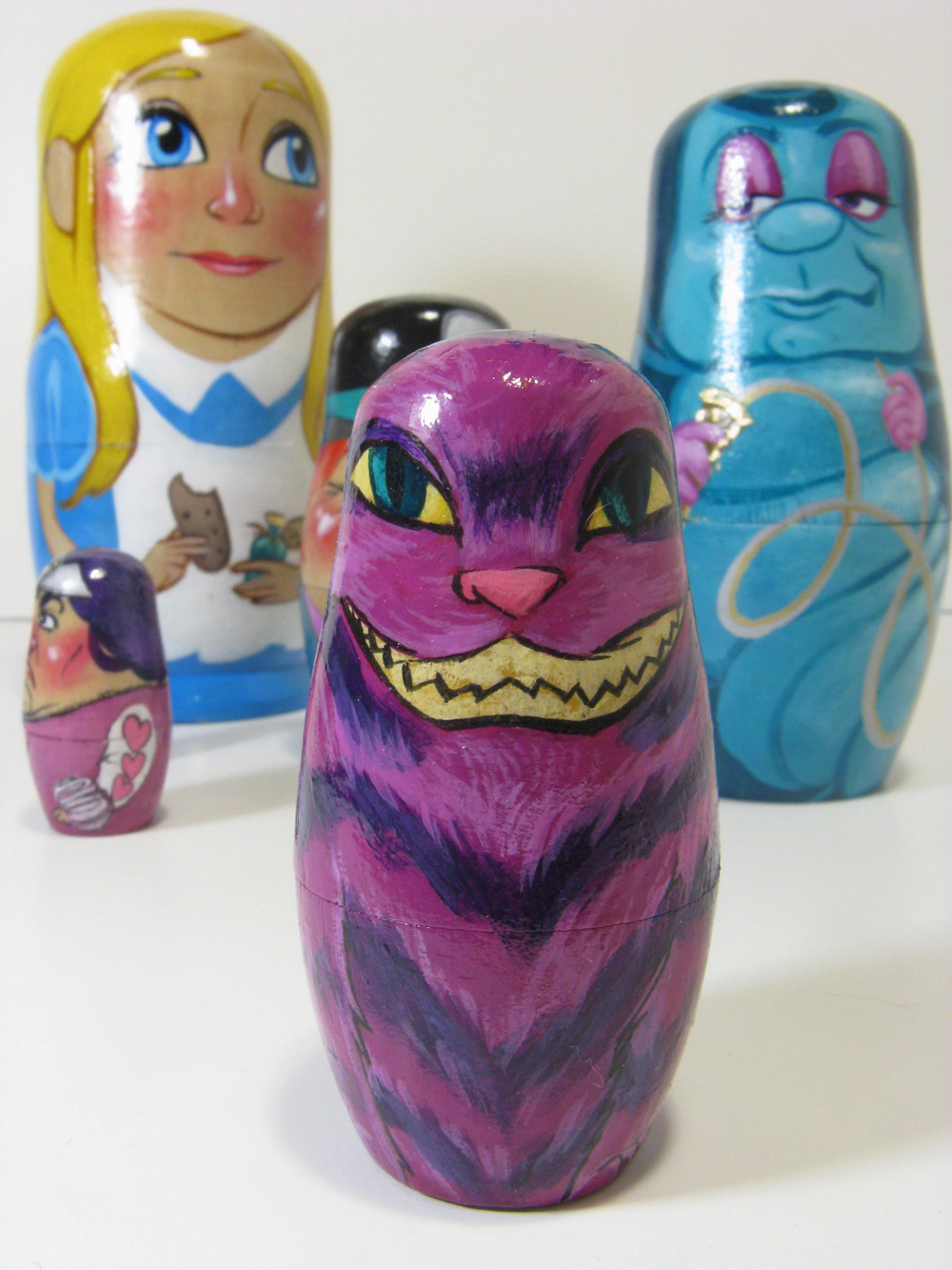
Next on the queue was Heather's awesome (ahem) gift for her wife Tina, who is an Alice obsessor. These took some time, and turned out REALLY cute (pat me on the back, quick)! Speaking of backs...

Boo-yah! White Rabbit!

The Caterpillar turned out really cool. I took a lot of cues from the Disney design, but still tried to bring my own aesthetic to each character. It was a unique opportunity to do my first set of these doll's not designed to look like any real life persons. As a result, these look more like 'my art,' than any of the likeness-styled dolls, in my opinion.


Sneeeeaky kitty. Tina loved them - Heather was thrilled. Mission accomplished!


These last two aren't gifts or holiday related in any way. I was tapped by The Infamous Commonwealth Theater of Chicago to design their season of posters. Above is the poster for A Doll's House, and below is what I came up with for The Fifth of July.